Squla answer button states
The original Squla is a learning app for kids from a pre-school age to 12 years old. It is originally a Dutch company, available for use in the Netherlands, Germany and Poland.
Their main user base is Dutch, and it is a well known app within the country, providing educational tools for 241k+ kids and operating for 17 years.
Background
Squla offers quizzes where kids can practice school subjects. These quizzes have multiple Question Types - single select QT, multiple select QT, highlight the correct answer QT, image answers QT, connect the dots, etc.
The answer buttons provide feedback by turning green for right answers, and red for false answers.
Multiple studies (1, 2) have shown that correcting false answers with a red color has a negative and demotivating effect on kids. This does not align with one of the core principles of Squla - the Growth Mindset.
Project context
How can we communicate to kids that they gave the wrong answer without using the color red?
The focus of this project was redesigning the false answer states of the quiz experience. We wanted to communicate to kids that getting a wrong answer is ok and that failing is a part of the process towards success. This way, they wouldn’t be saddened by their mistakes and shift their focus towards continuing to practice, which is the key element towards successful learning.
During this project, these were the main goals:
Design a false answer button that isn’t red
Communicate which answer was correct when they answer wrong
Design a state for the remaining answers - answers that weren’t picked, but also don’t correspond to the correct answer - we call them disabled answers
Design a pressed state for selected answers
UX needs
Needs
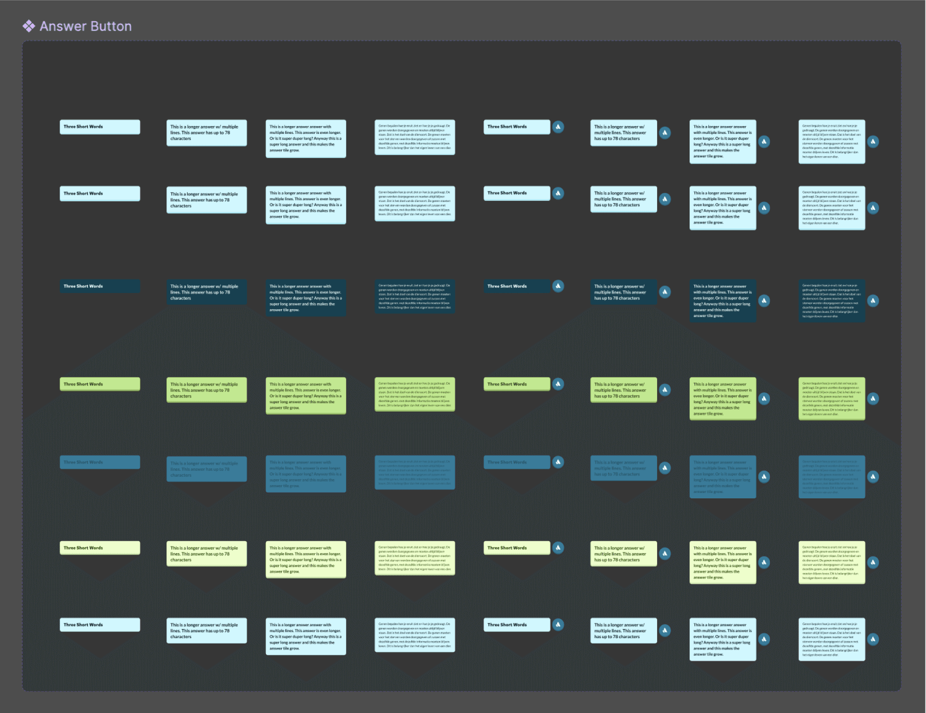
When redesigning, we had to take into account the different button states and lengths.
Furthermore, some kids use the app with an audio functionality as a learning aid. We needed to include the possibility of showing an audio button besides each answer on the layout of the answers.
States
Default
Hover
Pressed
Correct
Corrected
False
Disabled
Lengths
Short answer
Medium answer
Long answer
Very long answer
Accessibility
With text to speech audio button
Without text to speech audio button
Design solution
Default
We have kept the original blue color of this button.
Short Button
Correct
Answer button turns green.
Short Button
Hover
Bevel increases by 2px and button grows upwards.
Short Button
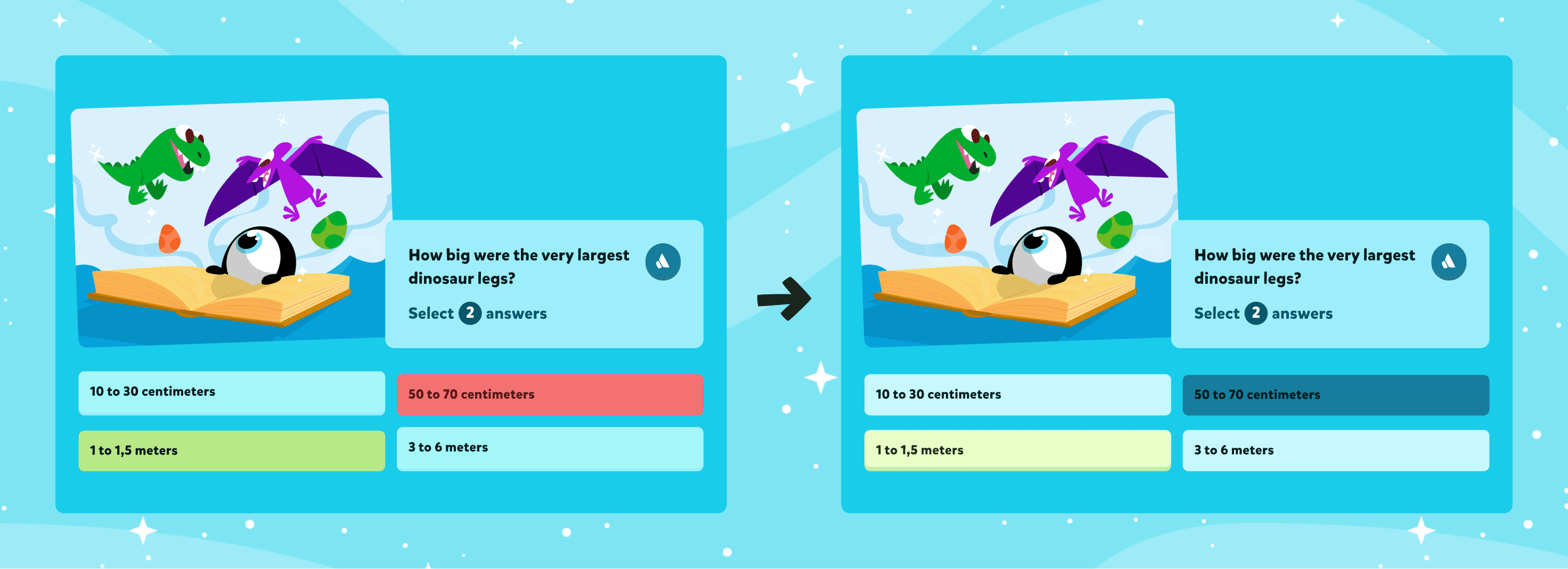
False
Answer turns a dark blue.
Short Button
Pressed
Button turns dark blue and text turns white. Bevel disappears.
Short Button
Corrected
Answer button turns light green.
Short Button
Disabled
Answer stays the same color, but gets pressed down by 4px.
Short Button
Our design system was cluttered with answer state components. With this redesign, I was able to reduce this amount from 108 to 56 components and clean up the documentation of the answer buttons at the same time.

Before - 108 components
After - 56 components
Micro-interactions

Multiple select question type where we answer 1 correct and 1 false
The story
When providing feedback to kids during their journey, we wanted the buttons to behave in FUN WAYS.
Once you have pressed your answers, all of the answers will slowly go down into a pressed state, and only the correct / false / corrected answers will pop up again, providing you with a clear visual of all the relevant answers, while diminishing the size of the answers that didn’t matter to your experience.
The assumption was that this action of lowering all of the buttons also creates some anticipation in seeing which of the answers will pop up again.
We wanted to highlight correct answers above the others, so we decided to add an element to this answer state that is already in use throughout the rest of the platform: sparkling stars. We already use these stars for every positive feedback on the platform, whether that’s receiving coins or levelling up.
As a next step, we needed to check in with kids and analyse 2 points:
Do kids understand this feedback clearly?
Do kids show frustration when getting a false answer?
User testing
Prototype used to test with kids
Quiz experience prototype
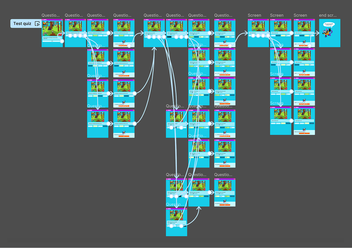
In order to assess the clarity of answers, I decided to build a prototype of an entire quiz experience as it would be shown on our app, with a short introduction to the quiz, 3 questions, and an end screen.
This test was designed and tested on tablet portrait format, because that is the most used device when kids play Squla.
We used a combination of 2 types of questions:
Single select QT
Multiple select QT
In addition, we made sure that one of the questions was hard to answer, so that there was a higher probability of the kids answering wrong.
Answer button prototypes
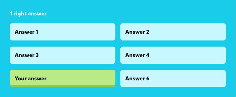
1 right answer
1 false answer

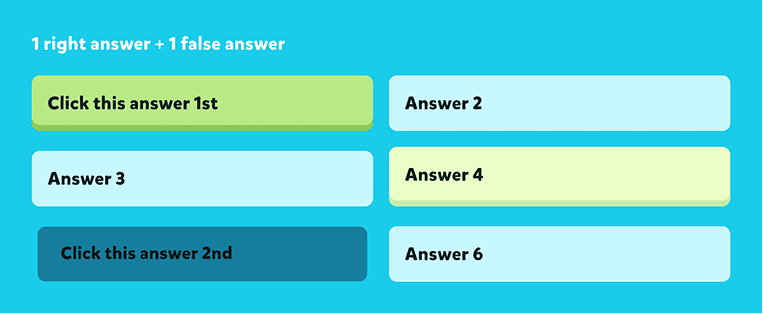
1 right + 1 false answer
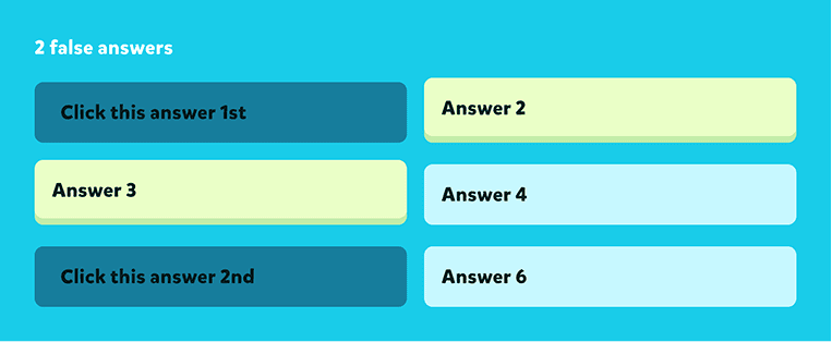
2 false answers
Documentation of the interviews
Validating the solution
We called into the office the kids of our own colleagues, who already play Squla and are familiar with the app. Some of the interviews were also conducted and recorded online, with the help of their parents.
Some of the questions we asked were:
What did you think of the quiz?
Did you answer this question correctly?
If you have answered incorrectly, what was the correct answer?
What do you like about this quiz?
In the end, I had gathered and documented the feedback on a total of 7 kids, aged 4 to 10.
During the quiz experience, all of the kids recognised the false answers as being false, the correct answers as being correct, and the corrected answers as the answer they should have picked. We did not pick up on a reaction of frustration, and some kids were actually disappointed when the quiz ended. Many of them wanted to play the quiz again because they found the experience fun.